A meter, a dashboard, and a monthly engineer review.
A meter on your main service plus a simple dashboard that answers four questions: What is the bill doing? Where is the cost coming from? What should we do? What pattern is causing it?
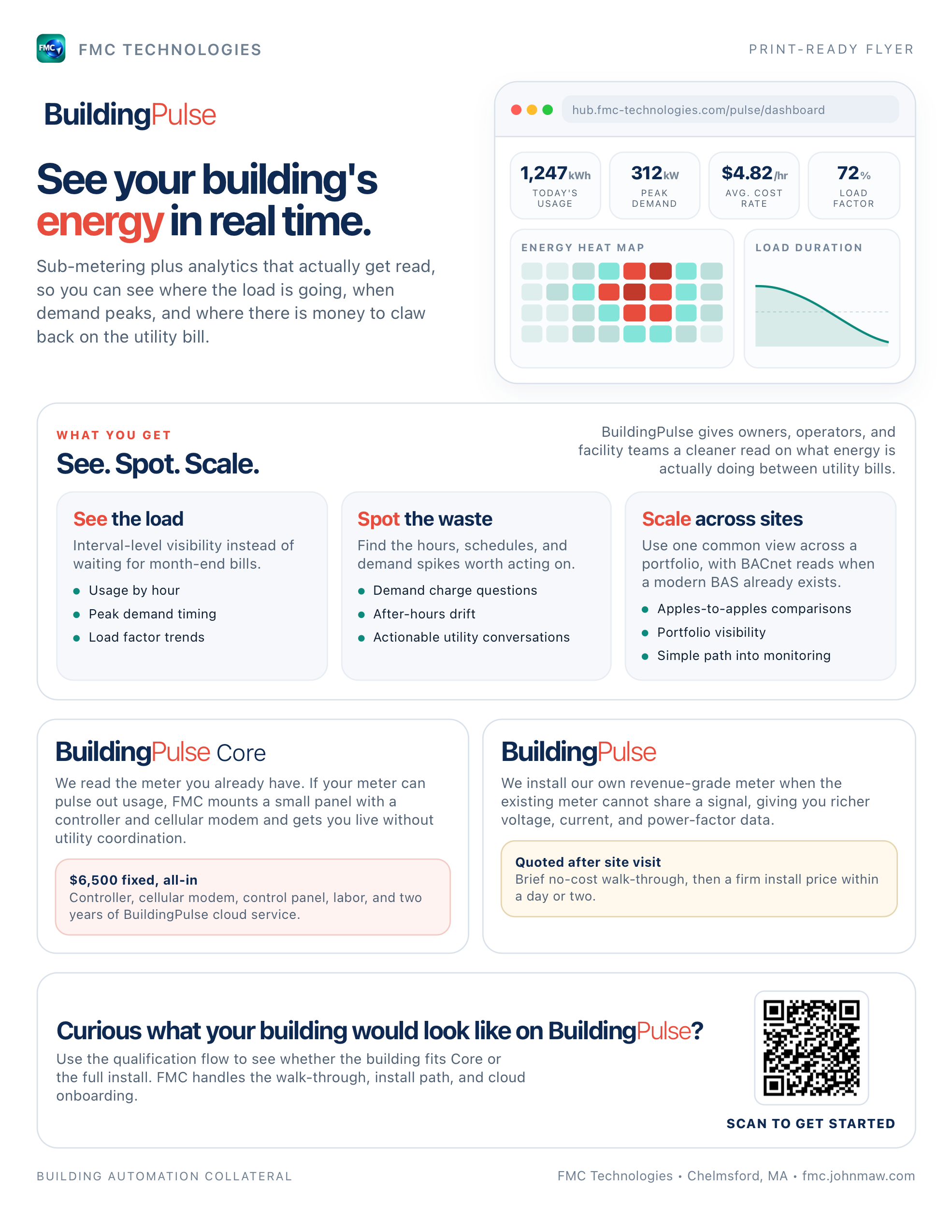
First step is a quick meter-eligibility check. Some buildings qualify for BuildingPulse Core — usually fixed at $6,500 all-in where eligible.
A focused view of building energy use.
The product stays intentionally focused. It is not another complicated building platform. It is a clear reading for managers, owners, and tenants who need to know what the building is doing now.
- Live load
Current demand
See how much power the building is pulling and when demand is climbing toward an expensive peak.
- Tenant clarity
Submeter views
Give tenants and owners a simple shared picture of energy use without exporting spreadsheets every month.
- Engineer review
Monthly notes
FMC reviews the trend, flags unusual behavior, and recommends practical fixes tied to the equipment in the building.
Four answers, every utility cycle.
The dashboard is built around four customer questions. Live demand and charts are not the headline. The bill is.
- The bill
What is my bill doing?
Projected bill, estimated utility-cycle progress, current demand versus the cycle peak, and a Demand Risk pill: Low, Watch, or High.
Projected Bill · Demand Risk · Live Demand - The cost
Where is the cost coming from?
Usage cost versus demand charge, with a clear visual split. One bad 15-minute peak can raise the demand charge for the whole bill.
kWh Consumption Cost · kW Demand Cost - The plan
What should we do?
FMC recommendations from simple, transparent rules: morning startup spikes, overnight load, weekend schedules, and demand-charge risk. Each card gives FMC and the customer a next step.
FMC Recommendation · Review with FMC - The patterns
What patterns are behind this?
Heatmap, demand curve, typical day, and monthly trend. The deeper read is there when you need it, but it stays below the money story.
Heatmap · Load Duration Curve · Day Profile · Trend
A short path from meter data to decisions.
BuildingPulse helps the owner answer practical questions: when to investigate, where to look, and whether the controls strategy is doing its job.
For owners
Track demand, compare months, and understand whether energy spend is following occupancy and weather.
For property teams
Catch unusual weekend load, tenant after-hours behavior, failed schedules, and changes that deserve a service call.
The numbers behind the bill.
Two views do most of the explaining: where load lands across the week, and the handful of hours that actually set your demand charge.
Every hour of every day, in one grid.
Rows are hours. Columns are days. Color is electrical load. If something runs at 3 AM that should be off, it shows up as a streak you can point at. If a holiday schedule fails, it becomes a darker band anyone can see.
Interactive on the live dashboard: hover any cell to see the date, hour, and load.
The forty hours a year that set your demand charge.
Utilities bill demand on the highest 15-minute window, not the average. This view sorts demand from highest to lowest, so the peak becomes obvious. Trim that corner and the demand charge moves.
Hover any point on the live dashboard to see the date, hour, and exact load for that position in the curve.
A monthly review from an FMC engineer.
Once a month, an FMC engineer reviews the dashboard with you, explains what changed, and sends a short list of things to try: startup timing, weekend schedules, demand peaks, tariff questions. With dollar estimates, ranked.
- Est. $420 / mo
Shift HVAC pre-cool window.
Peak demand spikes at 2–4 PM. Pre-cooling at 5 AM instead of 6 AM could shave ~18 kW off the peak.
- Investigate
Weekend base load anomaly.
Sat/Sun base averages 95 kW, only 22% below weekday. Equipment likely running on occupied schedules it shouldn’t be.
- Est. $180 / mo
Power-factor correction.
Estimated PF ~0.87. A capacitor bank could eliminate the recurring PF penalty on your bill.
- Est. $550 / mo
Rate tariff review.
Your load profile may qualify for a time-of-use tariff. We’ll model the switch against the last 12 months before you commit.
Sample insights from a real FMC review. Your building’s insights will be specific to your load shape, utility, and rate class.
Meter, connect, review, improve.


- Connect the meters
FMC ties utility and tenant meters into a secure reporting path and verifies that interval data is trustworthy.
- Launch the dashboard
The building gets a clean owner view with the readings and comparisons that matter.
- Review monthly
FMC checks the signal, explains what changed, and recommends the next adjustment or service action.
Core or full BuildingPulse.
The dashboard and engineer review stay the same. The difference is how we collect the signal: reading a pulse from your utility meter, or installing FMC’s own meter for sharper data. A two-minute check tells us which path fits.
Fixed price. One-day install.
If your utility meter has a usable pulse output, we can read it directly. No new meter, no service rework, no surprise scope at the end of the install.
- Reads the pulse output on your existing meter
- Same cloud dashboard, same monthly engineer review
- Installed in a single visit · no panel work
- 2 years of BuildingPulse cloud service included
Sharper data. Site-visit scoped.
If the utility meter cannot share a signal, FMC installs a professional-grade meter alongside it. You get voltage, current, power factor, usage, and demand. Bigger install, sharper data.
- FMC-installed meter on your service conductors
- Full voltage / current / power-factor telemetry
- Site visit confirms panel layout and scope
- Same cloud dashboard, same monthly engineer review
Practical features that come standard.
- Shareable dashboard
A URL, not an app.
Your BuildingPulse dashboard can be shared as a read-only link. Finance, facilities, and energy consultants see the same numbers without another login to manage.
- 12-month history
Exportable to CSV.
Every KPI, every hour, the full year. Useful for utility reviews, Mass Save support, and the quarterly energy memo someone always asks for.
- Temperature-normalized
Compare apples to apples.
Use weather normalization to separate real drift from weather. It helps answer whether this month was worse, or just colder.
- Utility-rate aware
Priced in your tariff.
Cost KPIs use your actual rate structure: usage charges, demand charges, power-factor penalties, and ratchets. Not a flat $/kWh estimate that misses the expensive part.
BuildingPulse is about the electric meter.
If you need equipment-level data, fault detection, or continuous diagnostics across the mechanical plant, that is the EMS layer — the controls work FMC designs, installs, and services. BuildingPulse stays narrow on purpose: one signal, two views, a monthly engineer review.
See what is driving the electric bill.
Two minutes to find out if you qualify for BuildingPulse Core. If you do not, the form routes you to a short site visit for the full install. No ambiguity either way.